![[map]](compass.gif) A Site Structure Pattern from
A Site Structure Pattern from
Patterns for Personal Web Sites
Cover Page
Good first impressions are important. On the Web, that means a having an attractive home page. However, looking good often comes at the expense of usefulness; as a rule, design-heavy pages load slowly, and convey little information. Web site creators are tugged in opposing directions: should the first page a visitor visits make an impression, or be useful?
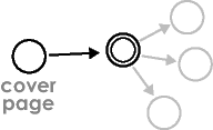
One can satisfy both of these criteria by splitting the two roles (usefulness & attractiveness) into two separate pages: a Useful Home Page, and a cover page that provides a good first impression for new visitors.
Therefore, to create a good first impression, create a separate cover page for your site.
Do not make a cover page the home page for your site. Make it a separate page with only one link, to the site's home page. Think of it as a nicely decorated entryway that a visitor passes through on the way to the real content.

The reason for separating the roles of cover page and home page is that you only need to make a first impression once. Return visitors don't need to see it again. Savvy return visitors will jump straight to your Useful Home Page, bypassing the cover page completely.
For this reason, think twice about giving a cover page the default URL for your site. Instead, give it a URL such as www.aboutme.name/intro.html, and give that URL to potential visitors. After they've seen the nice introduction, they will want to return to your Useful Home Page at the URL www.aboutme.name/ (whose brevity satisfies Guessable Urls).
There's nothing to prevent you from making multiple cover pages for different audiences. Each could be a Private Entrance.
Last updated 8 July 2003
http://www.rdrop.com/~half/Creations/Writings/Web.patterns/cover.page.html
All contents ©2002-2003 Mark L. Irons